A guide to CSS Grids and Flexbox
When it comes to learning about CSS Grids and Flexbox, you’re not just learning about aligning elements or making layouts responsive, you’re learning a foundational skill for building modern, accessible, and scalable web pages. Both Flexbox and Grid help maintain unity and consistency across your designs while giving you precise control over spacing, sizing, and alignment. Understanding these tools also allows you to implement layouts thoughtfully with real-world use cases, improving both the usability and performance of your website.
What is Flexbox?
Flexbox, or the Flexible Box Layout, is a one-dimensional layout system in CSS. It is perfect for arranging items either horizontally (row) or vertically (column) inside a container. Unlike traditional layouts that rely on floats or inline-blocks, Flexbox simplifies alignment, spacing, and distribution of elements, making it ideal for smaller components such as menus, buttons, and form elements.
Centering items in a navbar
One of the most common use cases for Flexbox is a navigation bar. With just a few lines of CSS, you can perfectly align your menu items:
nav {
  display: flex;
  justify-content: space-between;
  align-items: center;
}
Here, justify-content controls the horizontal spacing of the items, while align-items ensures vertical alignment within the container. This combination makes it easy to create professional-looking navigation bars without relying on hacks like negative margins or absolute positioning. Flexbox containers are typically used with divs, as these elements act as versatile wrappers for content and allow for clean, maintainable layout
Some use cases for Flexbox include:
- Navigation bars with evenly spaced items
- Buttons aligned in a row or column
- Horizontal or vertical forms
- Toolbars or action menus
Flexbox is particularly useful when your layout needs to adapt dynamically to different screen sizes, because items can grow, shrink, and wrap as necessary.
What is CSS Grid?
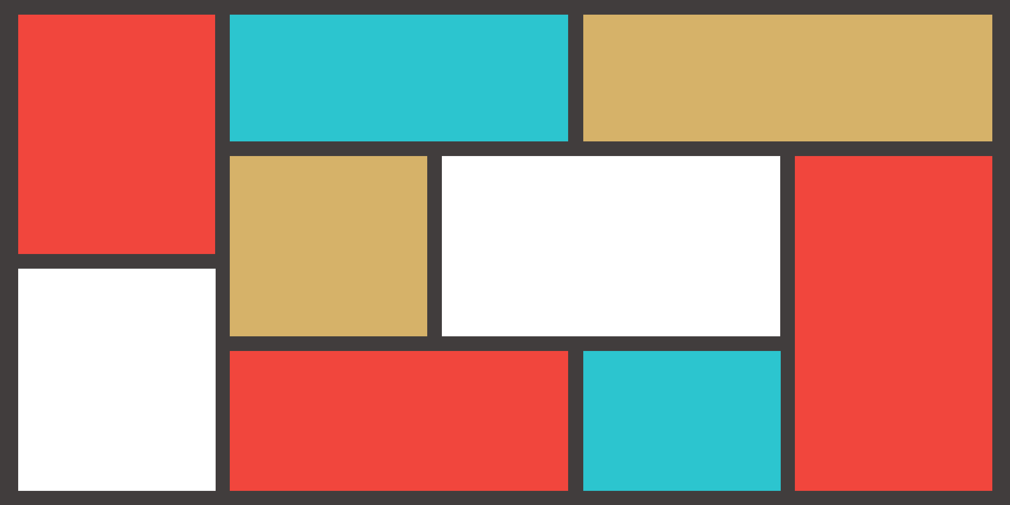
While Flexbox is one-dimensional, CSS Grid is a two-dimensional system. It allows you to design layouts that span both rows and columns, making it ideal for more complex arrangements like galleries, dashboards, or complete page structures.
Project gallery
.projects {
  display: grid;
  grid-template-columns: repeat(3, 1fr);
  gap: 20px;
}
This grid layout divides the container into three equal columns and adds a 20px gap between items. CSS Grid is incredibly versatile and pairs well with media queries, enabling your layout to scale seamlessly across devices. This makes it perfect for portfolios, blog posts, product cards, and dashboards.
Some CSS Grid Best Practtices include:
- Use
minmax()for flexible sizing - Implement
auto-fitorauto-fillfor responsive grids - Define gaps using the
gapproperty instead of margins
Grid vs Flexbox
| Feature | Flexbox | Grid |
|---|---|---|
| Dimensions | 1D (row or column) | 2D (row + column) |
| Best for | Navbars, buttons, small UI components | Full page layouts, galleries, dashboards |
| Ease of learning | Easier for smaller layouts | Slightly steeper learning curve |
Pro Tip: For optimal layouts, combine Flexbox and Grid. Use Grid for the overall page structure and Flexbox for smaller components inside each grid cell. This hybrid approach gives you full control while keeping your CSS manageable.
Common Mistakes made using Flexbox/Grid
Even experienced developers sometimes fall into traps when using these layout systems:
- Too many nested
divs: Over-nesting can make your HTML hard to read and maintain. - Forgetting
gap: Adding proper spacing is essential for clarity and visual balance. - Ignoring
minmax(): Flexible sizing ensures elements adjust smoothly on different screen sizes. - Mixing units incorrectly: Avoid using fixed pixels for everything—use percentages,
fr, orautowhere possible.
Conclusion:
Mastering CSS Flexbox and Grid is a must for modern web development. Replacing old table-based layouts with Grid and aligning content cleanly with Flexbox improves responsiveness, accessibility, and overall user experience. Experimenting with both systems allows you to create elegant layouts that work on any device, from mobile phones to large monitors. Once you understand the principles behind these tools, you’re not just coding—you’re designing web pages like a professional, with flexibility, efficiency, and aesthetic appeal built in.

